Company Administration
You have received your login credentials for the ScreenSoft system – a software solution for digital signage content management.
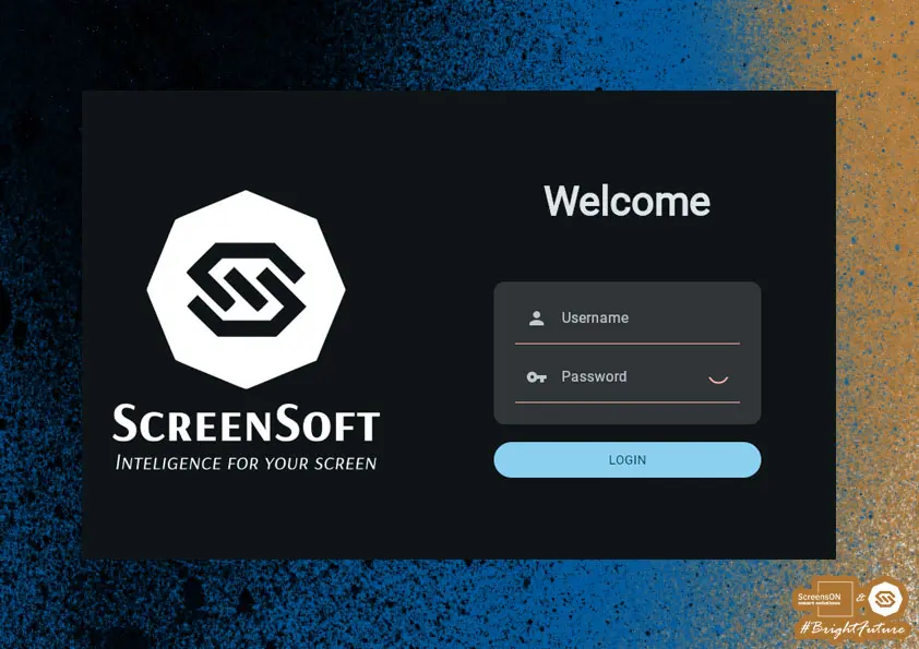
To access the system, open the following address in your web browser: https://my.screensoft.org
Before you begin, it is important to understand the basic principle of our software, which works with two content layers that can be switched by touch, top layer called presentation and bottom layer called application. Presentation layer is default and touching the screen activates the application layer. After a period of inactivity, the device automatically returns to the presentation layer, or using a back arrow displayed on the application layer.
Each layer can be enabled or disabled individually. If both are active, switching occurs by touch – from the presentation to the application layer. Returning is possible either automatically after inactivity or manually using the back arrow. If only the application layer is active, switching is not available and the back arrow is not displayed.
Presentation Layer
Displays non-interactive content such as advertisements, screen savers, notifications, or other passive visual content. It serves as the default state of the device.
Application Layer
Displays interactive content such as application menus, documents, polls, games, RSS apps, or web applications. It is activated when the screen is touched.
First Login
Once the page loads, a login form will appear.
Enter your received username and password into the appropriate fields.
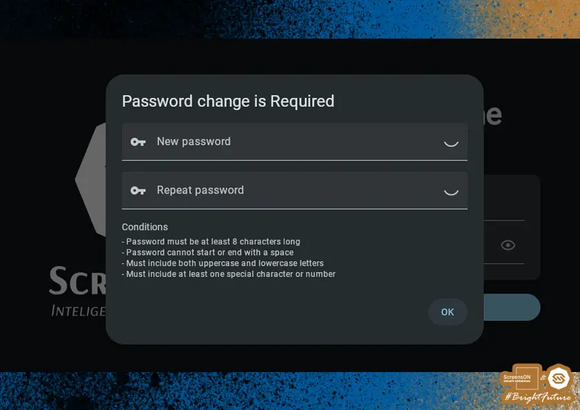
You will then be prompted to change your password according to your preference.
When choosing a new password, you must follow these conditions:
- The password must be at least 8 characters long
- The password must contain both lowercase and uppercase letters
- The password must contain at least one special character (?,!,=,% ) or a number
- The password must not begin or end with a space
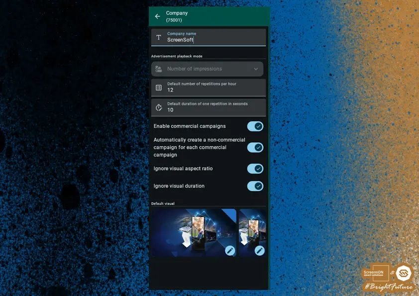
Company Settings
After successfully setting your password, you will see the initial (basic) ScreenSoft system dashboard.
- As a first step, it is necessary to set the basic company attributes – especially its name.
Advertisement Playback Mode
Number of Impressions
A simple tool for calculating impressions based on time and the number of repetitions.
Display Duration
- Defines how long a visual element (video or image) will stay on the screen.
- Measured in seconds – this is either the video length or the time the image is displayed.
Displays Per Hour
How many times the visual appears on the screen in one hour.
Occupied Space (%)
- This value shows how much of one hour is occupied by this visual element.
- Calculated as: Occupied Space = 100 × (Duration × Repetitions) ÷ 3600 (3600 seconds = 1 hour)
Example:
Video duration: 120 seconds
Repetitions: 6 times per hour
Total time: 12 minutes → Occupied Space = 100 × (720 ÷ 3600) = 20%
Interaction
- Changing Duration or Repetitions will update the occupied space.
- Changing occupied space will adjust repetitions accordingly.
Default Setting
- The actual video length may vary by ±10% from the entered value.
- For example, if you set the length to 100 seconds, the actual video can be between 90 and 110 seconds.
Video Duration Flexibility
- The actual video length can differ by ±10% from the entered value.
Fixed Slots
This setting comes from our software's roots – it was originally created for media agencies that need to sell slots of a specific size and duration. For most of our clients, it is not necessary, but it remains available for historical reasons.
Next, we recommend reviewing and, if necessary, adjusting the following settings:
- Enable Commercial Campaigns – necessary for accurate statistics tracking and reporting.
- Allow non-commercial campaigns to fill commercial campaign playlists – if enabled, any unused space in the playlist will be filled by these campaigns.
- Ignore aspect ratio of visuals – useful if you do not have assets in the exact screen format.
- Ignore visual duration – for situations where the length of visuals is not standardized.
- Default visuals – basic graphics or information that are automatically displayed if there is no active campaign.
Locations
Locations are crucial for structuring and properly targeting campaigns and applications. They allow you to efficiently group devices by their physical location and organizational structure.
Locations can be created for:
- A single specific device,
- Or as groups of multiple devices located in the same place.
Each location can contain one or more devices.
Important: When planning campaigns and deploying applications, pay close attention to which location they are assigned. Careless setup can lead to unwanted duplication of content on multiple devices.
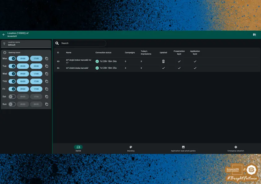
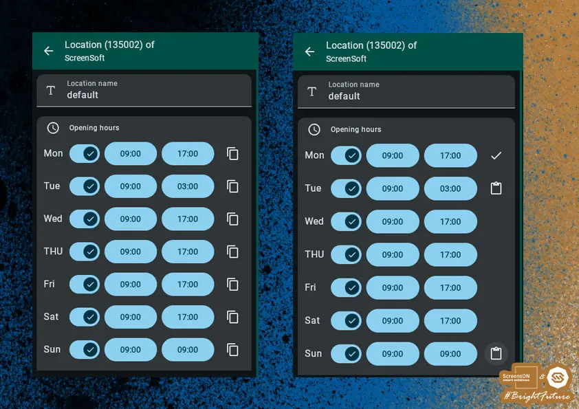
Opening Hours
Within Locations, you can set the operating time frame of screens, found in the upper left under Opening Hours.
You can define these:
- Individually for each day of the week
- Or in bulk for multiple days at once
This setting allows you to optimize device operating times, helping to extend screen life and reduce power consumption.
Note: Opening hours can be set to extend into early hours of the next day – for example 09:00–03:00 (on Tuesday). In this case, screen operation will occur:
- Tuesday from 09:00 to 23:59:59
- and Wednesday from 00:00 to 03:00 and 09:00-17:00
Branding
In the Branding section, you set the elements that determine the look and behavior of the application layer.
Specifically, you can adjust:
- Name displayed in the application layer
- Company logo in .PNG format with transparency, 512x512px
- Time limits:
- for accessibility mode
- for automatic closing of applications after inactivity
- countdown for returning to presentation layer
- Touch screen prompt
- Dialog windows and their display
- Color scheme of the entire interface
- Application icon size in preset buttons (so-called buttons)
- Application layout type
- Media cropping in photo gallery
Screen Color Settings
Each element contains settings for background color and text/symbol color.
| Element | Description |
|---|---|
| Global application background | Color of unused areas within the screen for selected apps. |
| Button and app background | Background color for app names, icons, and accessibility symbols. |
| Application background | Rectangular tiles in which app icons are displayed. |
| Primary panel | Left panel (vertical screen) or top panel (horizontal screen). |
| Secondary panel | Right panel (vertical screen) or bottom panel (horizontal). |
Setting the Touch Prompt
Branding also allows you to upload your own graphic touch prompt, which:
- Actively invites users to start the application layer,
- Can include text, a logo, or another visual element (e.g. “Touch the screen for more information”).
Technical Requirements:
- Resolution based on screen orientation:
- FHD vertical: 1080 × 1920 px
- UHD horizontal: 3840 × 2160 px
- Format:
.PNGwith transparent background (alpha channel)
Application Icon Size in Buttons
Each app is represented by its own icon or photo so that it can be easily and quickly identified by the user. Each variant needs different settings to best match the look of the rest of the screen.
Application Layout Type
We have two options – with a photo gallery or without.
- With gallery – suitable mainly when there are fewer apps on the desktop, enhances appearance. Also great for quick announcements (promos, discounts, etc.).
- Without gallery – if you do not have suitable multimedia content or if your application area is already full and you do not want to waste space.
Recommendation: If you have graphic content, we recommend using the With Gallery option.
Cropping Media in Gallery
Media display on the kiosk screen can have two forms – cropped or uncropped.
- Cropped – only a square section of the visual is displayed, filling the entire gallery area.
- Uncropped – the visual fills part of the gallery area, is scaled down and not distorted. The rest is filled with a Gaussian blur of the same image (similar to videos on phones with incorrect aspect ratio).
Recommendation: Prepare graphics in your corporate colors with an emphasis on readability and contrast, ideally with enough space around text.
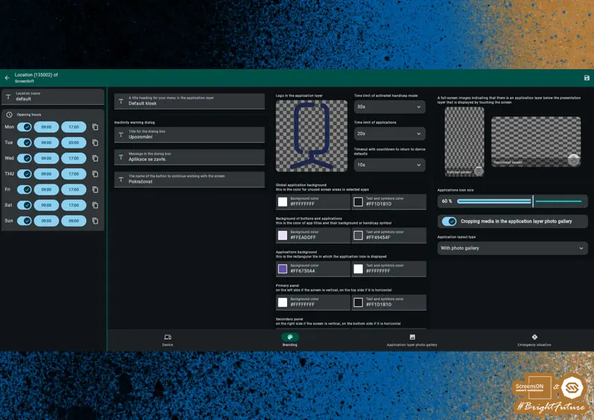
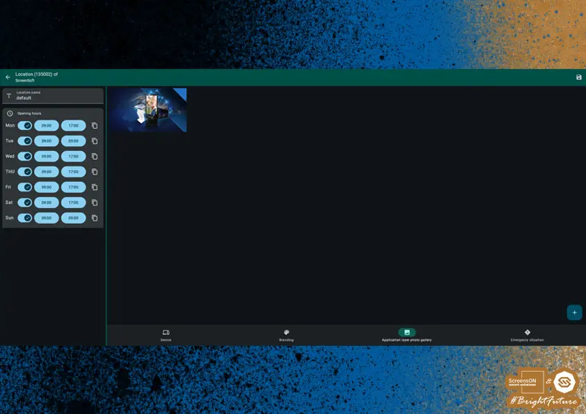
Photo Gallery in Application Layer
If you have selected the application layout type "with photo gallery", you can upload your own images that will appear among the app icons and enhance the look of your application page.
Images in the application layer cycle regularly, and when any image is clicked, the full gallery is shown.
If you have few apps on the page, the photo gallery helps create a visually more attractive and pleasant environment.
Images can be added by clicking the "+" button in the lower right corner of the interface.
Recommendation: Upload representative photos from your company environment – for example, from everyday operations, company events, or activities carried out at the location. These visuals help create an authentic and professional presentation for end users.
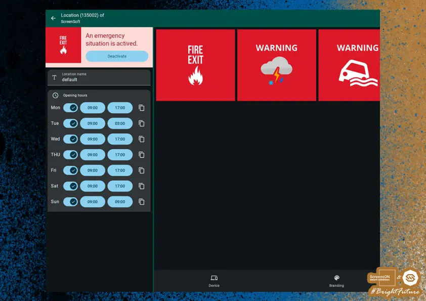
Emergency Situation
The last option within location settings is the Emergency Situation function. Here you can predefine crisis scenarios that may occur at your location (e.g. building, office, or other premises). The most common situation is fire, but the choice of scenarios is up to you.
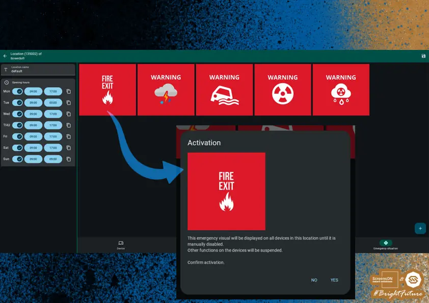
After activation of an emergency situation, a pre-set warning graphic corresponding to the specific crisis event will automatically appear on all screens at the location.
This content remains active until it is manually deactivated by the system administrator.
To add your own emergency situation, including custom visual (recommended aspect ratio 1:1), use the "+" button in the lower right corner.
Note: This feature can play a key role in ensuring personal safety and effective communication during emergencies at a given location.
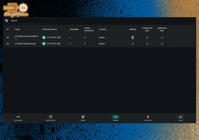
Devices
On this page, you can see an overview of all devices assigned to your company. These devices are automatically added to the company during their physical installation and can then be assigned to a location of your choice.
Campaigns and applications can be run on individual devices. Devices can be easily searched by their name and the name of the location they are assigned to.
We recommend paying special attention when naming devices.
Device Settings
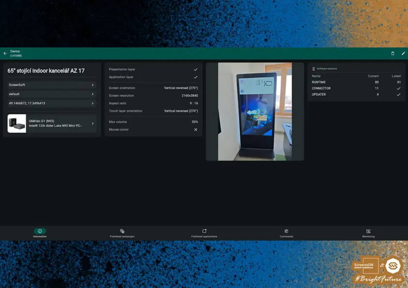
On the main DEVICES screen, you can find all important attributes, such as:
- Device name,
- Location,
- Software version,
- Presentation and application layer status (running / disabled),
- Screen orientation,
- Screen resolution,
- Aspect ratio (horizontal or vertical),
- Touch layer orientation,
- Volume settings,
- Mouse cursor enabled,
- Photo of the device itself
Very important for technicians when searching for devices.
All this data can be edited using the pencil icon in the upper right corner of the screen.
Screen Editing
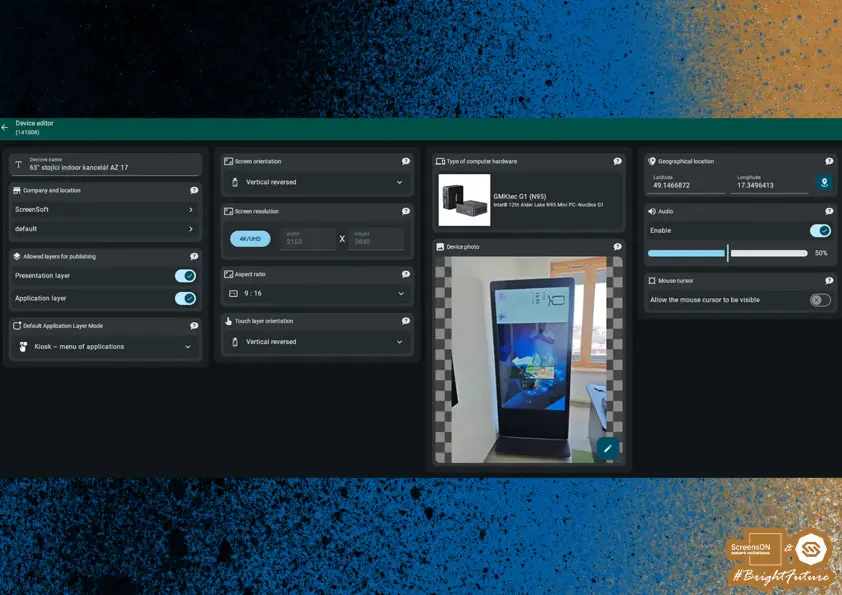
Please fill in the data very carefully – this will greatly simplify finding the device, especially in shopping malls or larger buildings. Accurate information also helps when resolving any issues via the help line.
Start by setting the device name. We recommend the following naming format:
- Screen size, if devices differ (e.g. 65", 55", etc.)
- Location details (e.g. kitchenette, office, in front of the building, floor)
Example device names:
Office 50" – 1st Floor – Office
Retail 65" – 4th Floor – by the escalator
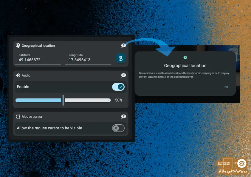
Next, you need to enter the geolocation, i.e. the exact place where the device is located. For automatic location detection, simply click the button with the location icon – the coordinates will then be filled in automatically.
Setting the type of computer hardware – this is especially important for troubleshooting via the help line or support.

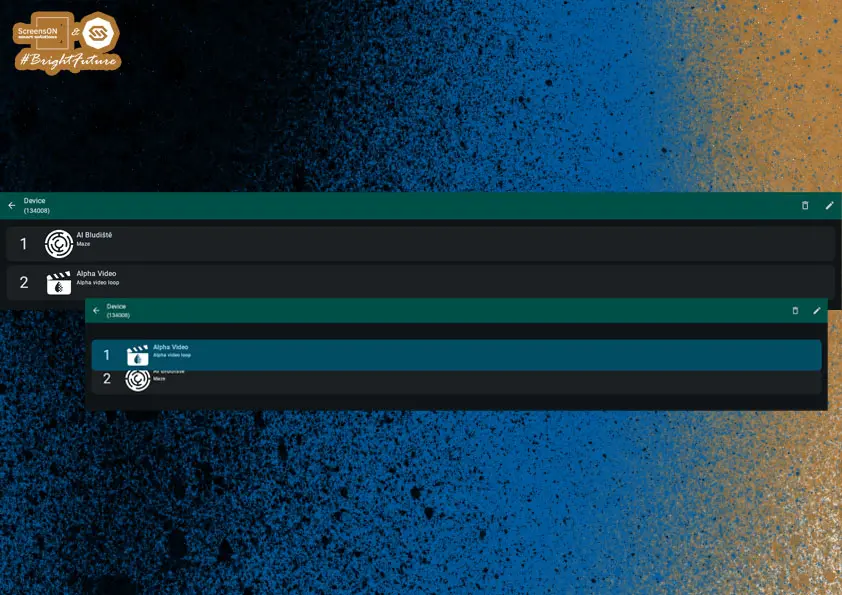
In the Devices section, you can also change the order of published campaigns and applications.
However, for campaigns you can only change the order within individual groups – commercial and non-commercial campaigns cannot be interchanged, as commercial ads have a higher priority.
Changing the Order of Campaigns and Applications
The order of both campaigns and applications can be changed simply by drag and drop – just hold down the left mouse button and drag the cursor by the campaign or application number.
If you click the image, you will see the detail of the campaign or application.

Changing the order of published applications:
Device Association with Company and Location
Every device must be assigned to a specific company and location.
This assignment is crucial, as the corresponding settings are automatically applied to the device:
- Opening hours – determines when the device (screen) turns on and off automatically.
- Campaign playback mode – according to the company settings (impressions vs. time slots).
- Branding – including logo, colors, and application layer look.
- Published campaigns and applications – the device automatically inherits the content assigned to the location.
- User access – the device is managed only by users authorized for the company.
Note: Correct device assignment ensures trouble-free system operation and simplifies management.
Live Preview of the Screen
To see what is currently being shown on a device, go to Devices → Commands → Remote Preview.
Here, you can start a live preview of the whole screen to check the content or troubleshoot issues remotely.
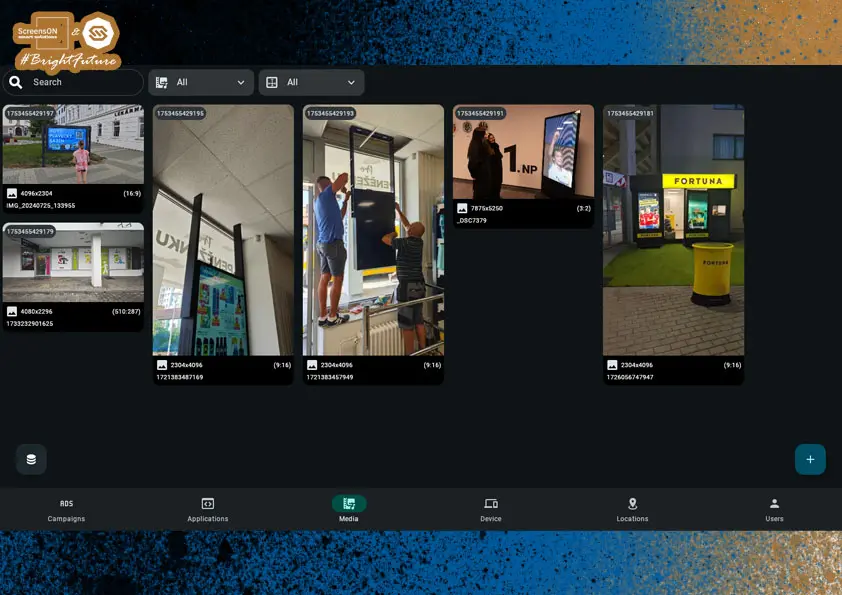
Media
Whether you are working in the application or presentation layer, you will use various types of media – from PDF documents and video files to icons for individual applications.
All these multimedia files are managed in the Media section.
On the main media page, you can:
- Add new files using the "+" button in the lower right corner.
- Manage, edit, or delete already uploaded files.
- Search for media by name.
- Filter files by document type or orientation (e.g. portrait/landscape).
This section allows you to work efficiently with all visual content used across the entire ScreenSoft system.
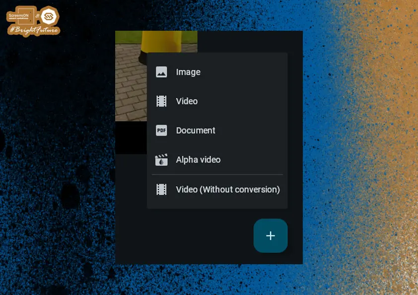
After clicking the "+" button, first choose the file type you want to upload to the system.
You can select from these main categories:
Documents (DOC)
Supported formats:
- Microsoft Word:
.doc(application/msword)
.docx(application/vnd.openxmlformats-officedocument.wordprocessingml.document) - Microsoft Excel:
.xls(application/vnd.ms-excel)
.xlsx(application/vnd.openxmlformats-officedocument.spreadsheetml.sheet) - Microsoft PowerPoint:
.ppt(application/vnd.ms-powerpoint)
.pptx(application/vnd.openxmlformats-officedocument.presentationml.presentation) - OpenDocument formats:
.odt(OpenDocument text)
.odp(OpenDocument presentation)
.ods(OpenDocument spreadsheet) - Other:
.rtf(Rich Text Format)
.pdf(Adobe Portable Document Format)
Video
Supported formats:
.mp4(MPEG-4 Video).avi(Audio Video Interleave).webm(WebM Video).mov(QuickTime Video).m4v(M4V Video).mkv(Matroska Video).mpg(MPEG Video)
Video with Transparency (Alpha Video)
.mov(Apple ProRes with alpha channel support)
Note: Alpha videos support transparency and are suitable for layering animated elements over other content.
Images
Supported formats:
.jpeg,.jpg(JPEG Image).pjpg(Progressive JPEG).png(Portable Network Graphics).webp(WebP Image)
Recommendation: Before uploading files, check their format and size. For best results, use commonly supported and standardized formats.
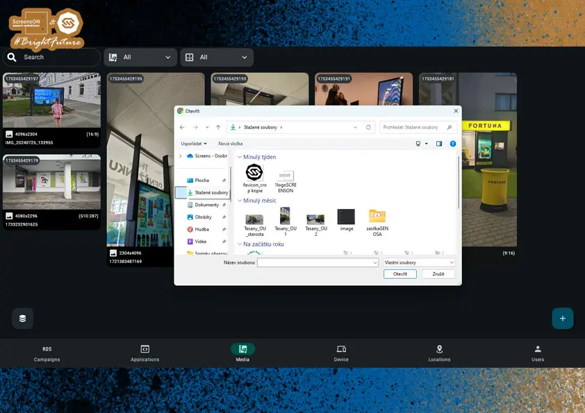
After selecting the file type, a standard file dialog will open (based on your OS) where you simply select the file you want to upload.
Note: After selecting the file, it will be automatically uploaded to the media library, where it can be assigned to campaigns, applications, or as default content.
Media Preview
In the upper right corner of this preview you will find two action icons:
- Pencil (🖉) – used to edit the file (e.g. rename, change description, or replace the image).
- Trash (🗑️) – allows you to permanently delete the file from the system.
Note: If the file is used in any campaign or application, it cannot be deleted.
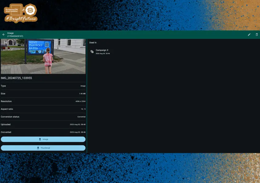
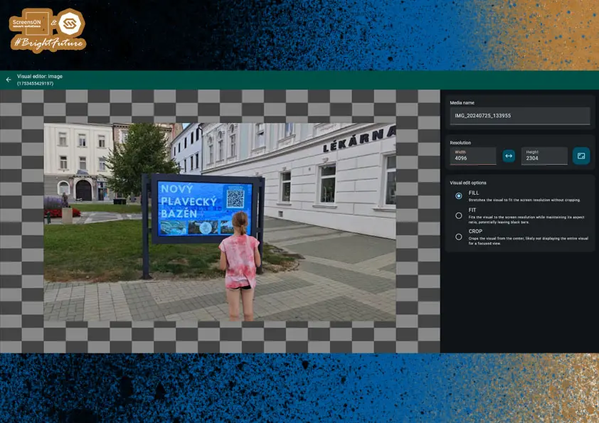
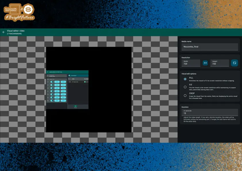
Editing Visuals
Once a file is saved in the system, you can work with it further. Clicking on a specific image/video opens its detailed preview.
This is what the file edit page looks like – in this case, it's an image. Similar options are available for video editing.
Note: The editing interface is tailored to the media type, so options differ between images and videos.
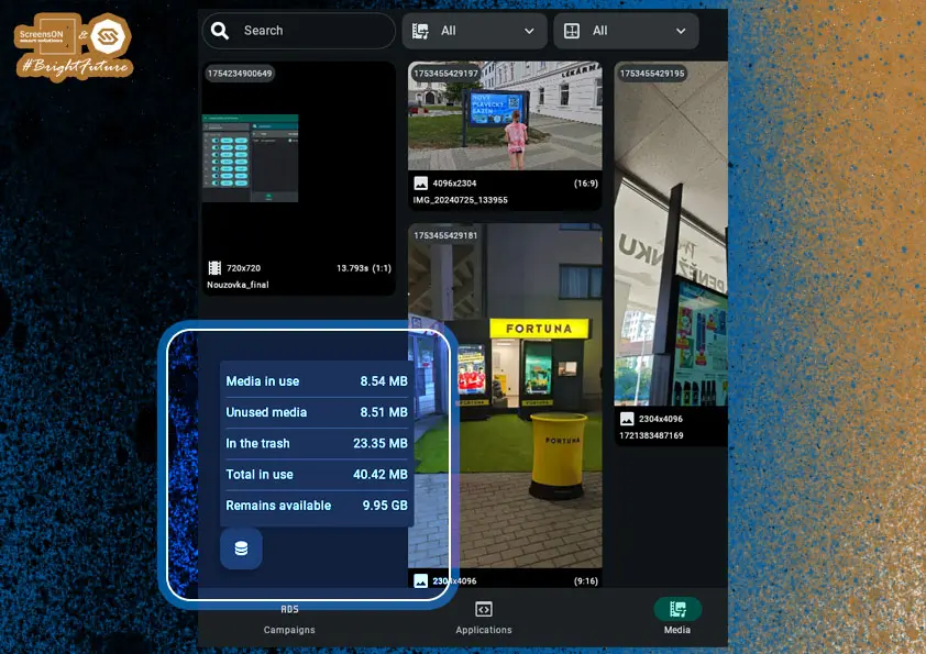
Storage Usage
On the main screen of the media manager, you can continuously monitor:
- How much storage space you have used with your files.
- How much free space you still have.
This information helps you work efficiently with content and avoid issues when uploading new files.
Recommendation:
If you approach your storage limit, we recommend:
- Contacting our technical support for capacity increase options.
- Deleting unused or outdated files that are no longer part of active campaigns or applications.
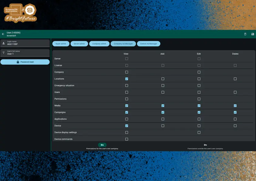
Users
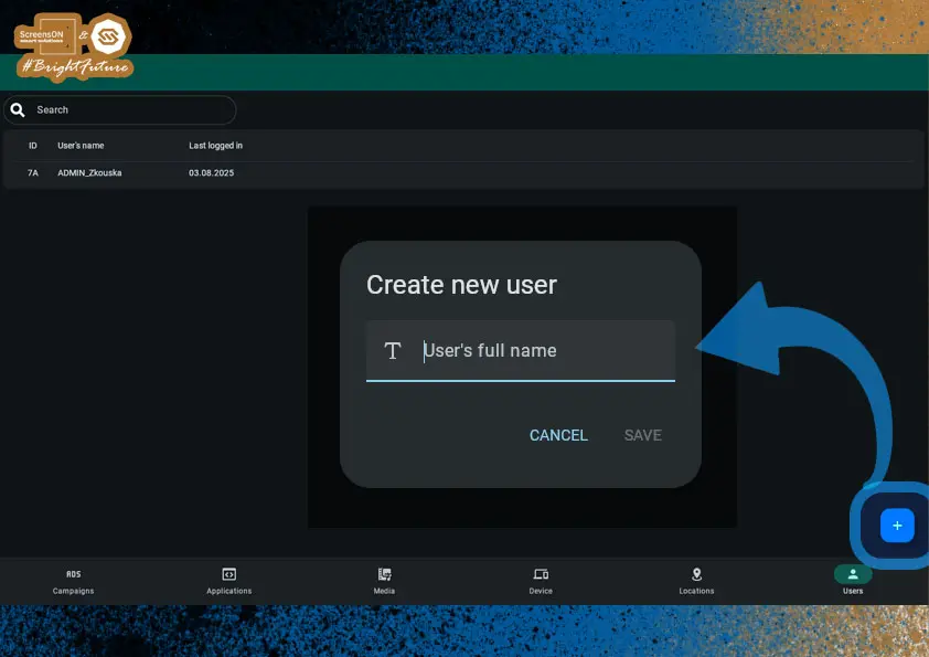
The heart of any software is its users, who are created by the company administrator in the Users section.
Add a new user by clicking the "+" button in the lower right corner. A dialog window will appear, where you must enter the user’s name.
A login name is automatically generated, which the user will use to log in to the system.
Every new user has the default password "123456"; on their first login, the user will be prompted to change this password. If the password is lost, it can be reset via the SW interface.
And so, we symbolically return to the first point of this guide – logging in.
Next, you need to set permissions for the user – that is, what they can view, add, edit, or delete.
Most often, you will choose from predefined roles such as company administrator or company advertising administrator.
However, permissions can also be customized – by adding or removing specific rights using checkboxes.
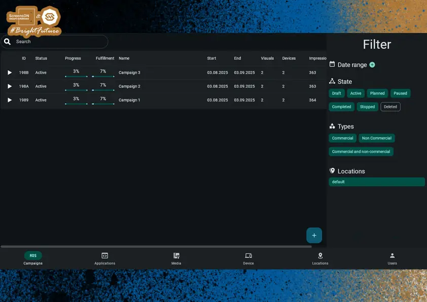
Campaigns
Campaigns are used to promote products, services, partner companies, or any other content – most often in the form of multimedia visuals.
Creating a Campaign
Just like in other parts of the system, you start by creating a new campaign using the "+" button in the lower right corner.
Example: A campaign can include a banner ad, video spot, event invitation, or internal communication for employees.
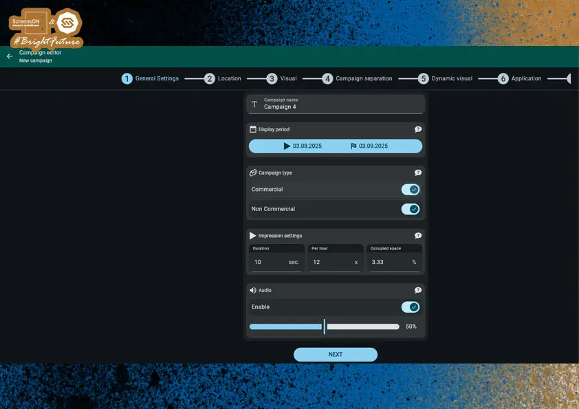
Campaign Settings
After clicking the "+" button, the campaign editor – the so-called campaign dashboard – opens. In its first step, you set the basic campaign parameters:
General Settings
- Campaign name – for easy identification in the system.
- Display period – date and time from–to when the campaign should be active.
- Campaign type – commercial or non-commercial (important for statistics and reporting).
- Display method:
- Campaign duration (in seconds),
- Number of impressions per hour,
- Space usage (percentage of the available broadcast time).
When you enter two values, the third is automatically calculated by the system.
- Sound enabled – allows playback of sound (e.g. for videos). Only activate in locations where the device has audio.
When you have filled in all required fields, click "Next" to proceed to location selection for your campaign.
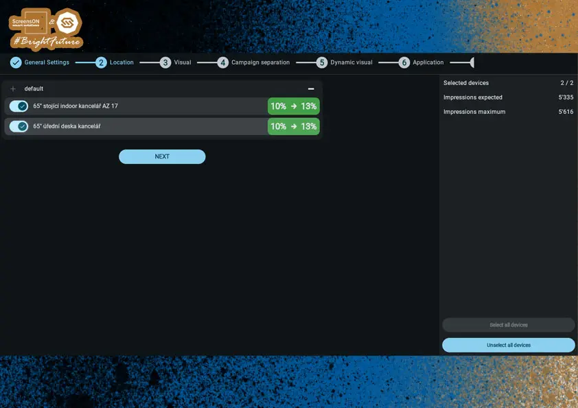
Location Settings
In this step, you determine in which location(s) the campaign content will be displayed.
You will also see:
- Graphical and numerical indication of space usage on screens,
- information about whether there is still capacity for the campaign,
- and how much of the available broadcast time the campaign will take up (in percentage, up to 100%).
Note: If capacity is already fully used at a location, the system will notify you and you will not be able to save the campaign until you change the parameters or location.
Occupied Space on the Screen
-
Shows what percentage of the screen is occupied by the given visual.
-
Formula: Occupied Space = 100 × (Duration × Number of impressions) ÷ 3600
#### Example Calculation
Video duration: 120 seconds
Impressions: 6× per hour
Calculation: 100 × (120 × 6 ÷ 3600) = 20%
Once you have chosen the location, click "Next" and proceed to selecting the visual content for the campaign.
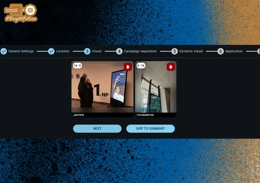
Visual Settings
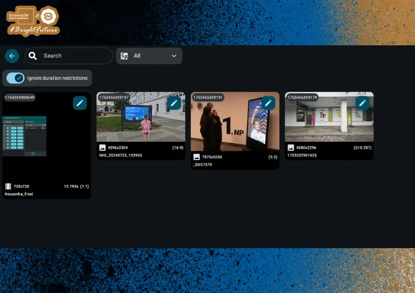
In the Visual tab, you select which visual content will be assigned to the campaign. The selection depends on the screen settings from the devices in the chosen location (e.g. 16:9 vs. 9:16, etc.).
A separate visual must be defined for each aspect ratio. Clicking the appropriate rectangle (placeholder) opens the media library where you can select the desired file.
After selecting the visual, you have two options to continue:
- Go to Summary – here you can:
- Save as draft
- Start, or
- Schedule its start
- or Advanced campaign settings – campaign separation, conditional visuals, and optionally applications
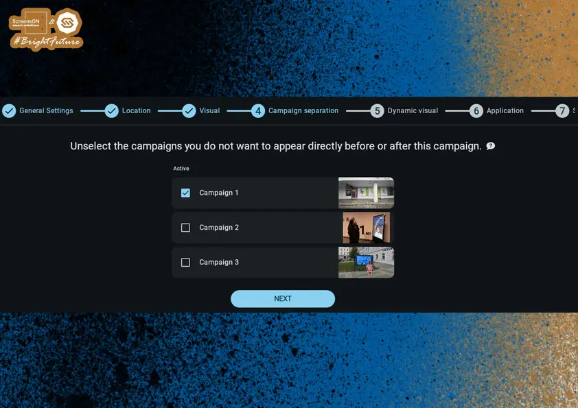
Campaign Separation
Sometimes, you may not want two particular campaigns to appear next to each other – for example, if you have an ad for Mercedes and BMW and these brands do not want to be promoted together on the same screen. There may be many other reasons for not placing certain ads directly after each other.
This is what the Campaign Separation card is for, where you can easily set which campaigns must not be displayed at the same time.
Other campaigns may have restrictions relative to this campaign. Selected campaigns can, as usual, be played directly before or after this campaign. Unselected campaigns cannot be placed next to it in the playlist. If one or more campaigns are unselected, the system ensures that there is at least one selected campaign between this campaign and any unselected one.
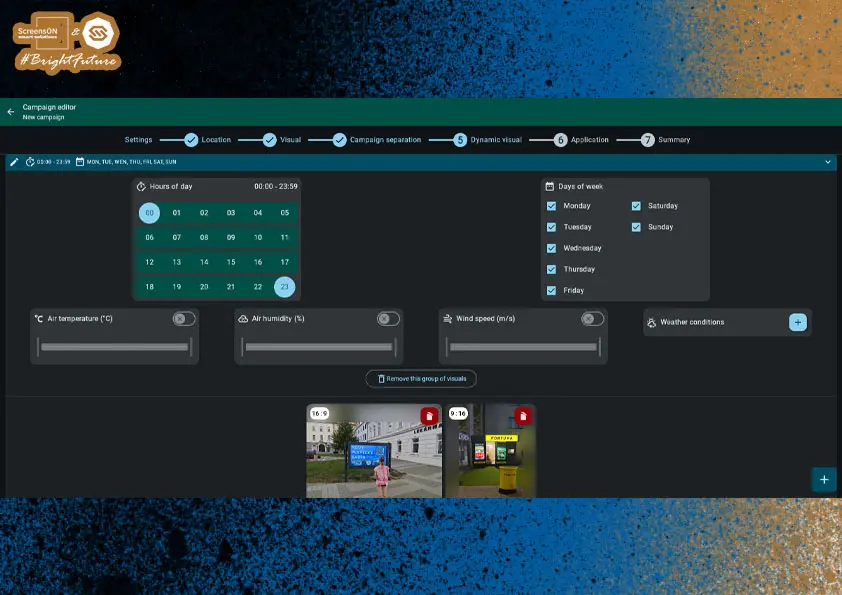
Dynamic Visual
You can assign one condition, a set of conditions, or multiple sets of conditions to your campaign, under which the default visual is replaced by a visual designated for those conditions. This makes the campaign truly dynamic, although this feature is not required for campaigns to work.
Key Features:
- You can create one or more groups of dynamic visuals.
- Each group contains its own set of conditions.
- When all conditions in a group are met, its visual replaces the default.
- If the campaign requires visuals in multiple aspect ratios, you can assign dynamic visuals to all, some, or none of them.
- If no dynamic visuals are selected in a group, the group will be automatically deleted upon saving.
Example Setup
Dynamic visual group "A" conditions:
- Show only on Sunday
- Show only from 11:00 to 13:00
Dynamic visual group "B" conditions:
- Show only on Sunday
- Show only from 11:00 to 13:00
- Show only if the weather is sunny
Logic:
- The default visual is played from Monday to Saturday and on Sunday except from 11:00 to 13:00
- The dynamic visual from group "A" replaces the default on Sundays from 11:00 to 13:00, but only if it is not sunny
- The dynamic visual from group "B" replaces the default on Sundays from 11:00 to 13:00, but only if it is sunny
Dynamic visual group selection rules on the device:
- The algorithm selects a qualified group, where all conditions are met
- If multiple groups qualify, the one with the most conditions is chosen
- If multiple qualifying groups have the same number of conditions, the last created group (top in the editor) is chosen
The default visual will never play if:
-
The dynamic visual group has conditions to show from Monday to Sunday and from 00:00 to 23:59
-
This is because a dynamic visual always takes priority over the default
If you're happy with your settings, click Next again to enter the final window of the Campaign Dashboard.
Application
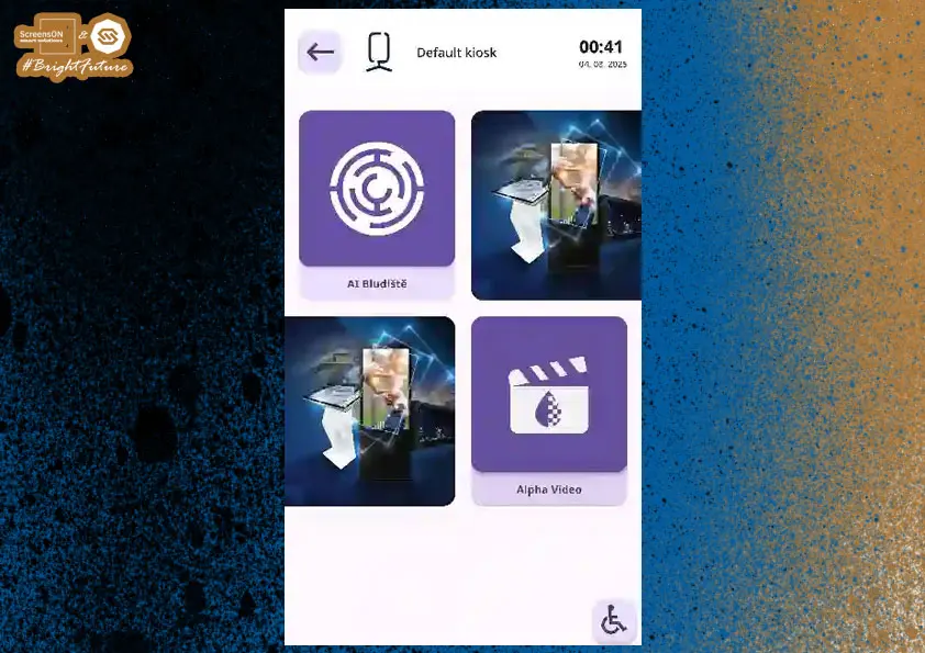
If you have the Maze game or the Alpha Video app (with 3D effects and video animations) in your applications, you can launch them directly from a campaign using a QR code.
This QR code can be colored and positioned as needed within campaign settings.
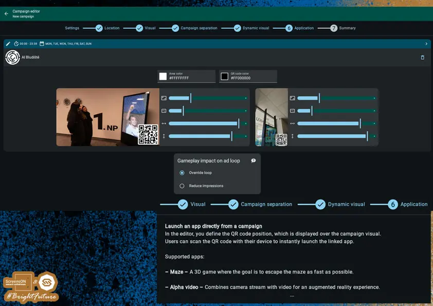
⚠️ Warning:
It is important to carefully consider how the game or Alpha Video will affect the running ad loop. We recommend setting exactly how the campaign should behave during and after the application is launched.
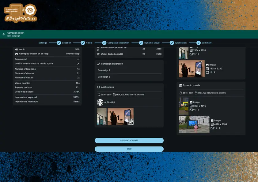
Campaign Summary and Completion
Your campaign is now fully configured and you are at the final step – Summary.
Here you have two options:
- Save and activate – the campaign starts immediately and will be displayed on the selected devices according to the set parameters.
- Save – the campaign is saved in the system but is not yet active.
This mode is suitable, for example:
- for subsequent approval by a supervisor,
- or if you want to launch the campaign later.
Note: Saved drafts can be found in the campaign overview and you can edit, activate, or delete them at any time.
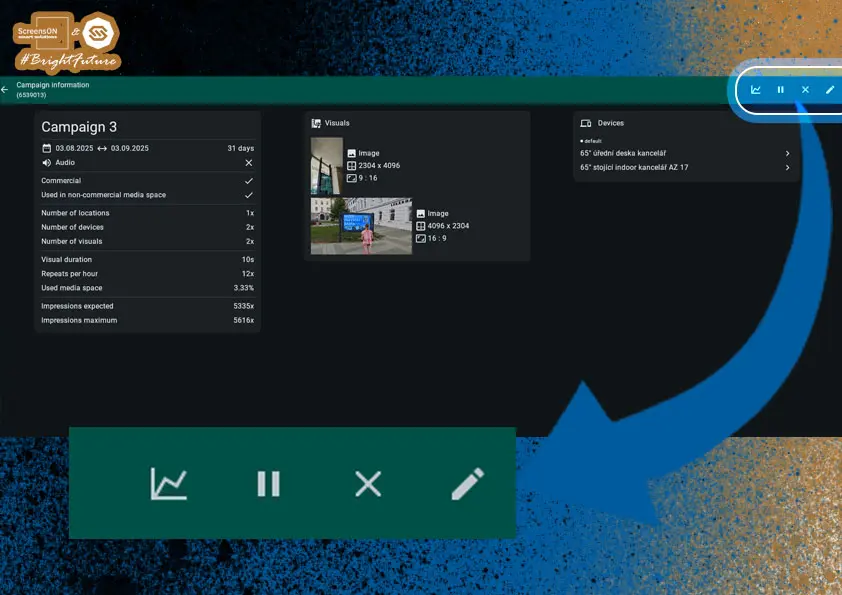
Editing a Published Campaign
If you need to edit an already published campaign, follow these steps:
- In the campaign overview, click on the desired campaign.
- In the upper right corner of the Campaign Information screen, you will find a menu with more actions.
- Click the pencil icon to open the campaign for editing.
In addition to editing, you will also find the following action icons:
- Pause – temporarily pauses the campaign (can be resumed at any time).
- X – stops the campaign but keeps it in the campaign list (e.g. for archiving or future use).
- Graph – shows statistics for commercial campaigns, such as the number of impressions, involved locations, or content effectiveness.
Note: Any changes to an active campaign take effect immediately after saving.
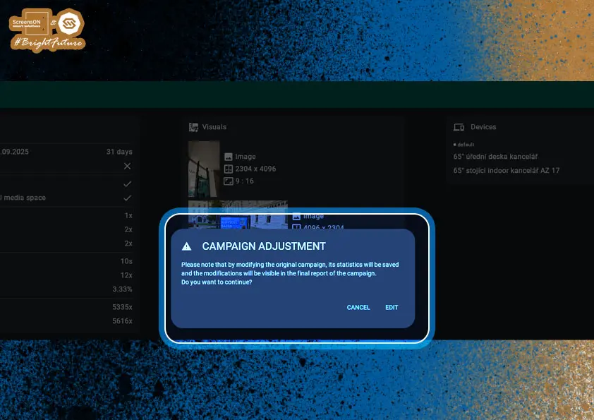
Editing a Campaign – Confirming and Saving Changes
Before editing, the system will warn you that the campaign change will be recorded in the statistics. After confirming the prompt by clicking the "Edit" button, the campaign editor will open, where you can make the necessary changes.
Once finished, you will find the floppy disk icon 💾 in the upper right – click it to save your changes. The new campaign version will be applied immediately on the selected devices (depending on the campaign’s current schedule and conditions).
Note: Every campaign change is logged for history and statistical relevance.
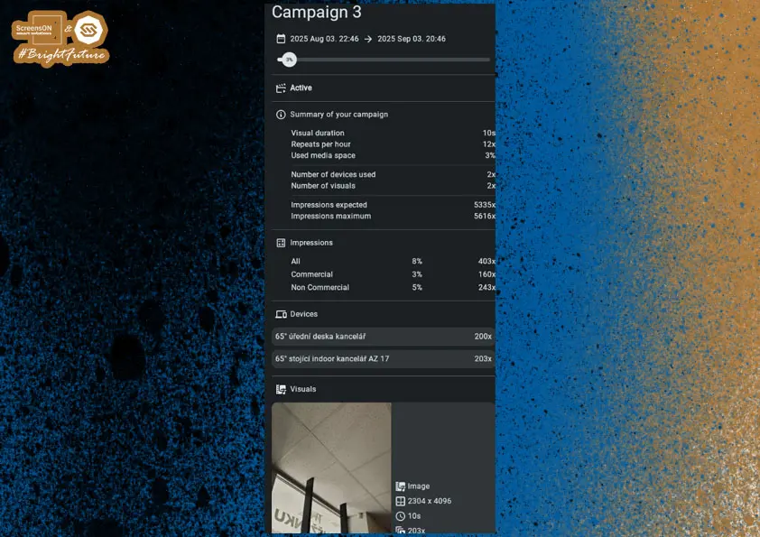
Campaign Statistics
For commercial campaigns, you can monitor their performance with a clear campaign report.
After clicking the graph icon (Campaign Report), clear statistics will be shown to help you assess if the campaign meets the set objectives – e.g. number of views, participating locations, or deployment effectiveness.
You can also download this report as a PNG and save it for further use (e.g. archiving or presenting results).
- Download by clicking the download button at the bottom right of the report page.
Note: Statistics are available only for campaigns marked as commercial.
APPLICATIONS
Applications are designed for customer interaction with the touch screen. Their main goal is to capture the user's attention, engage them, and allow them to use everything the operator offers – thus increasing engagement and potential profit.
With applications, the user can:
- Browse the operator's web pages
- Read documents or presentations
- Play videos
- Play interactive games and use other multimedia features
Applications help to keep the user engaged on and at the screen as long as possible, thus increasing the effectiveness of digital communication.
Adding an Application
Start creating a new application by clicking the "+" button in the lower right corner.
Note: As with campaigns, the system will then guide you through setting the name, content, visuals, and display conditions.
Application Type Selection
After clicking the "+" button, a dashboard with application type selection appears, letting you define what content or interactive element you want to display on the screen.
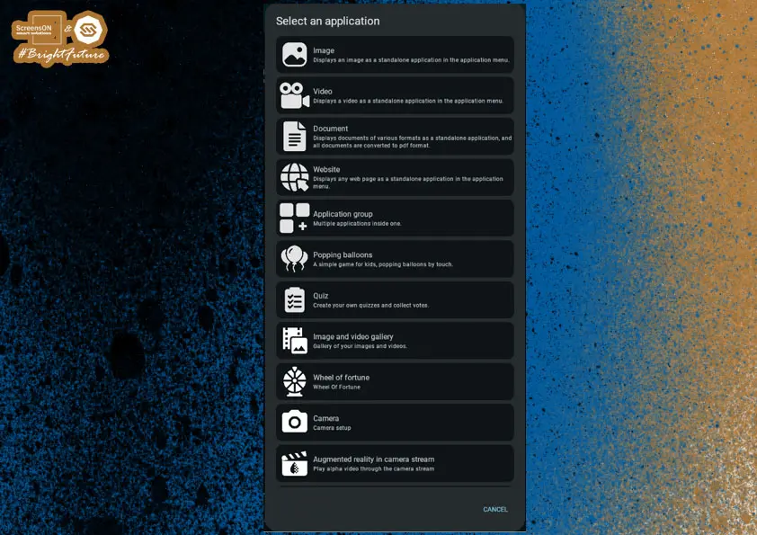
Available application types include:
- Image – static visual, e.g. poster or infographic.
- Video – plays a video, with sound option (if active).
- Document – displays PDF, Word, presentations, and other text files.
- Web Page – opens a specific URL, ideal for a company website, microsite, or e-shop.
- App Group – group several apps under one icon (e.g. a directory or menu).
- Balloon Pop – simple interactive game to attract attention.
- Poll – users can vote and see results instantly.
- Image and Video Gallery – smooth presentation of multimedia.
- Prize Wheel – fun way to draw prizes or reward visitors.
- Camera – display a live feed from a built-in or connected camera.
- Augmented Reality in Camera Stream – effects or objects projected into the real environment (AR element).
- Maze – simple game for fun and engagement.
- USB Media Player – direct playback of files from a connected USB device.
- RSS Feeds – loads and displays news, updates, or internal information.
Our IT development team responds to your suggestions and is constantly preparing new applications. If you need a special application just for you, contact us with your requirements and we will get back to you with a solution proposal and pricing.
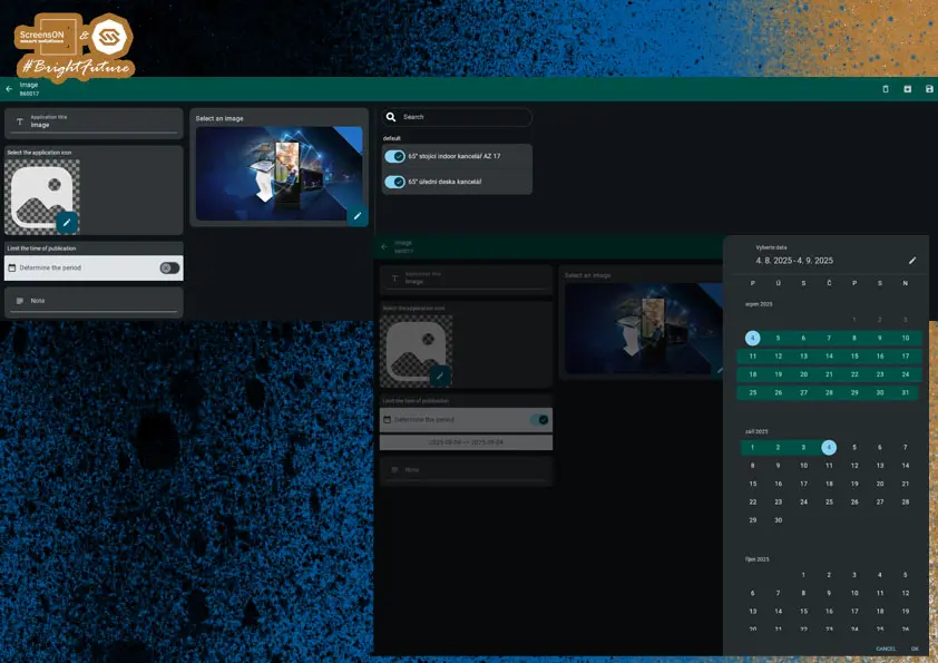
Application – Image
When creating an Image application, you set the following parameters:
- Application name – displayed directly below the icon to help users understand its purpose.
- Icon – represents the app in the application layer (select from media or upload your own).
- Image – the main visual that opens after clicking the app.
- Target devices/locations – specify on which screens this app should appear.
After uploading the image and all settings, remember to click the floppy disk icon in the upper right to save the application, which will then run in the application layer.
Application – Web Page
This app type allows you to display a specific web page directly in the application layer. When setting it up, define the following:
Basic Settings:
- Application name – displayed below the app icon.
- Icon – represents the app in the menu.
- Web address (URL) – exact link to the page you want users to access.
Display and Behavior Options:
- Keyboard display – choose whether a virtual keyboard appears during interaction.
- Full screen display – the page stretches over the whole display without borders or controls.
- Navigation controls – option to show basic navigation (back, refresh, etc.).
- Touch behavior – choose:
- Mobile mode (like a phone)
- or Desktop mode (like a computer)
- Default zoom level – sets how big the page appears at first load.
- Maximum page resolution – defined in percent, affects scaling to screen size.
- Blocking external sites – strongly recommended for security; ensures the user cannot leave the set domain.
Finalizing:
Once everything is set, remember to save the app by clicking the floppy disk icon in the upper right corner.
Note: For interactive kiosks, it is advisable to block access outside the desired website (e.g. via a whitelist or external link blocking).

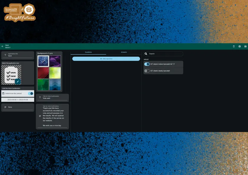
Application – Poll
This app is ideal for collecting customer feedback, for example, satisfaction with services, service quality, or product ratings.
Basic Settings:
As with other apps, you set:
- Application name – displayed under the icon.
- Application icon – represents the app in the menu.
- Target device/location – specifies where the poll is displayed.
Advanced Settings:
You can further define:
- App appearance – customize colors, style, and graphics.
- Message after submission – text shown after the poll is completed (e.g. "Your answers have been submitted.").
- Thank you note – short message to thank for participation (e.g. "Thank you for your time!").
Question Types:
Each poll can contain any number of questions in these formats:
- Single choice – e.g. YES/NO.
- Multiple choice – e.g. A, B, C, D (the user can select one or more answers).
- Text answer – free entry of opinion or comment.
Note: Polls are great for more than just satisfaction – use them to collect suggestions, preferences, or votes on planned changes.
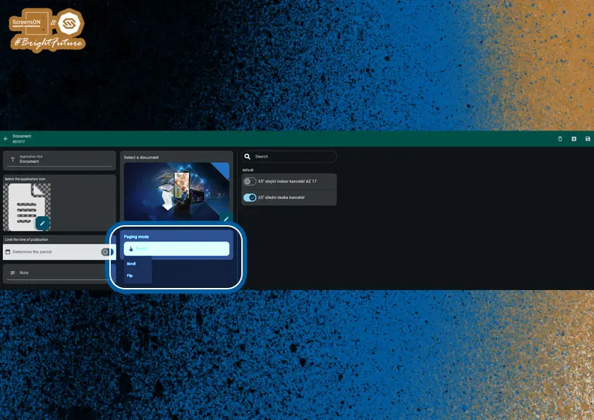
Application – Document
With the Document app, you fill in the same attributes as with other apps – name, icon, display period and location.
What makes this app different is the choice of paging mode. You have two options:
- Scrolling – move content up and down,
- Paging – move left and right (horizontally).
And as always, don't forget to save your document by clicking the floppy disk icon in the upper right.
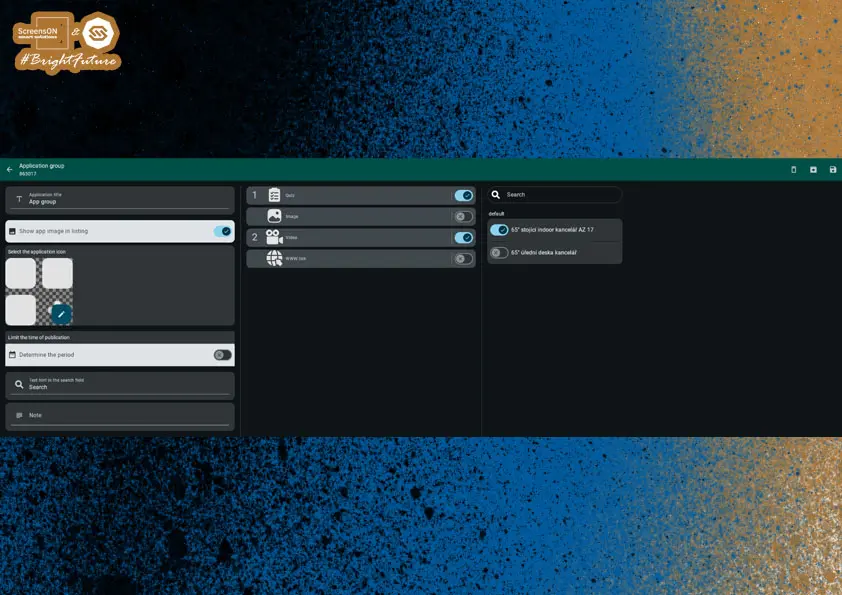
Application – App Group
App Group is used to combine several apps under one link, making the interface clearer and allowing thematic grouping of content.
Example Uses:
- Merge photo galleries from multiple years into one shared folder.
- Create a directory of games or entertainment under a single icon.
- Divide content by target group (e.g. Adults / Children).
Basic Settings:
As with other app types, set:
- App name
- Icon
- Device/location where the group is to appear
Group Composition:
In the middle part of the app editor, select from the list of already created and active apps that you want to include in the group using a toggle switch.
Important note:
If any of the apps in the group is already published on the same device, you need to remove its device assignment in its original configuration.
Otherwise, it will appear twice – separately and within the group. Sometimes this is intentional, but in most cases, it is best to avoid it.Note: App Group is a great tool for organizing the screen offer, reducing visual clutter, and creating thematic units for a better user experience.
Dear Partner, you have now completed the full guide for setting up our software. Congratulations and we look forward to seeing you at training, where we will cover setup in greater depth – as well as possible "tricky" scenarios that may await you.